Path-to-Purchase Redesign
Role: UX, UI, & Research • Timeline: 4 weeks • Scope: Design Sprint

Role: UX, UI, & Research • Timeline: 4 weeks • Scope: Design Sprint

Understanding the
Madison Reed is an online subscription-based hair color company that individually matches every customer with the right shade of permanent hair color. It offers a unique, ammonia-free line of products and free color consultations with licensed colorists. However, customers visiting the Madison Reed website had hard time understanding how the company was different from the competition. They also were overwhelmed by the number choices and struggled to select the right color. This resulted in low conversion and high drop-off rates. To solve these problems, we decided to run a Design Sprint.
Day 1


Day 2
Day 3
Day 4
Day 5
Earlier this week, we recruited 6 users that fit our persona profiles and scheduled testing sessions for the last day of the Sprint. While I and conducted user interviews, the rest of the team watched them from another room and took notes of their observations. During these sessions, we made a lot of interesting discoveries. While we were on the right track to simplify the color selection process, we still had a lot of work to do in the areas of informing the customer about Madison Reed hair color and giving her the right balance of guidance and freedom.
Additional
Quickest Path To The
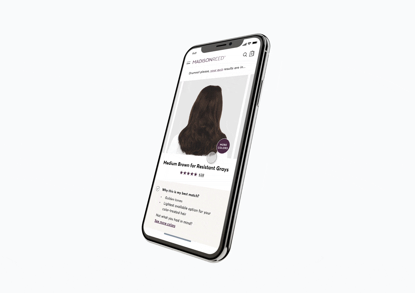
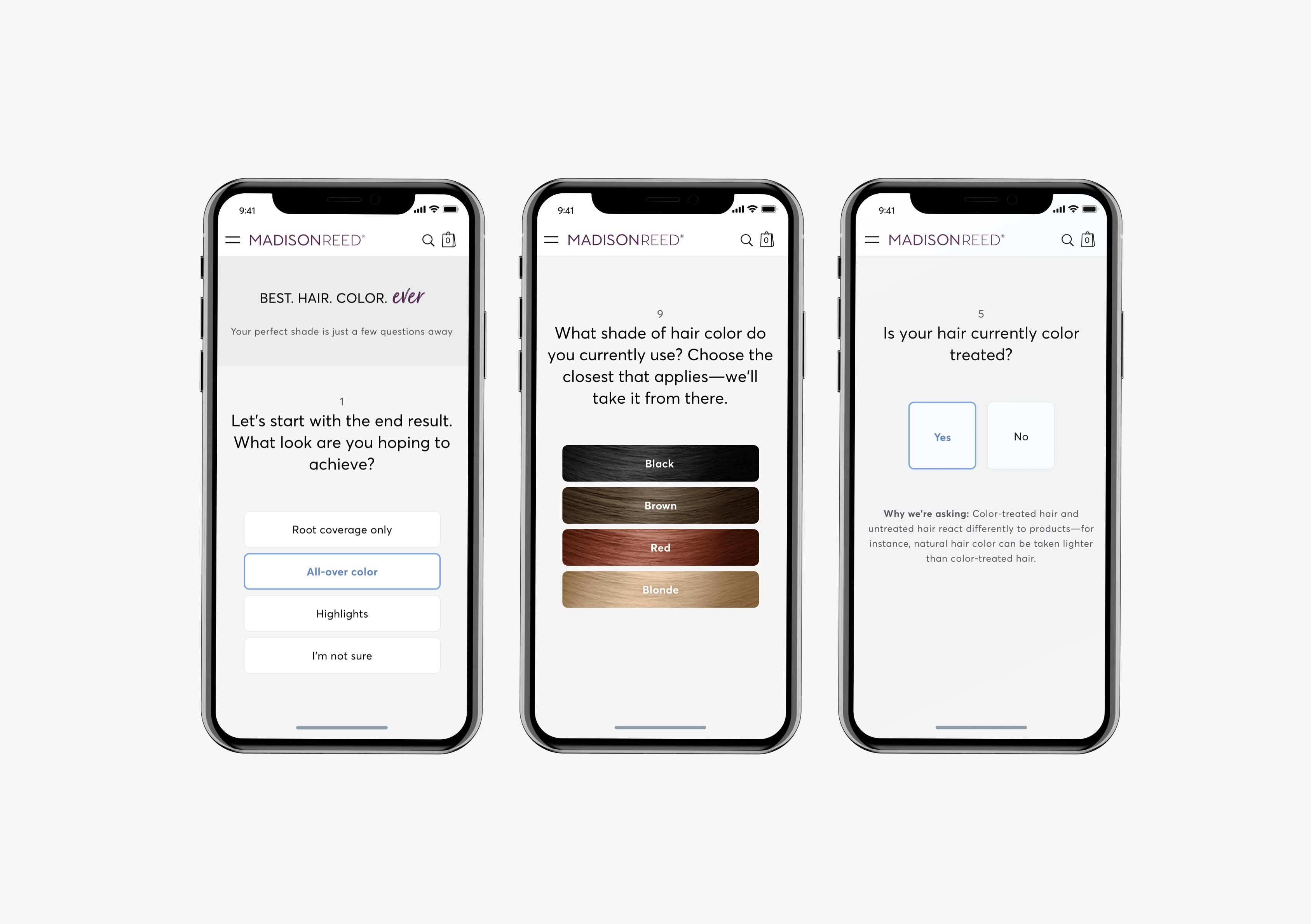
Previously, the customer would receive up to 5 recommendations of the the hair color, which was too many choices for her. Now, the customer was recommended on primary color as her best match. She is also given an option to tweak this color if the recommendation didn’t meet her expectations. In addition, we provided an explanation as to why the customer was recommended a certain shade.
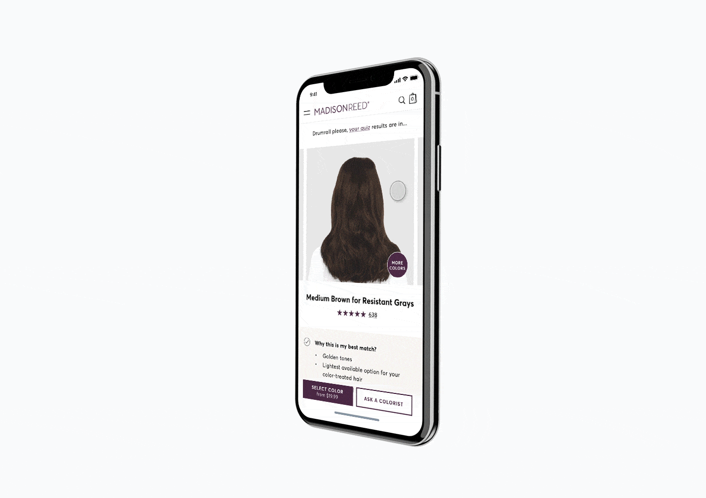
We introduced another path to purchase from the Product Detail Page that allowed the user to quickly connect with a color expert. This feature is aimed to help hesitant customers by providing them with help when selecting the right color and making colorists just one click away.
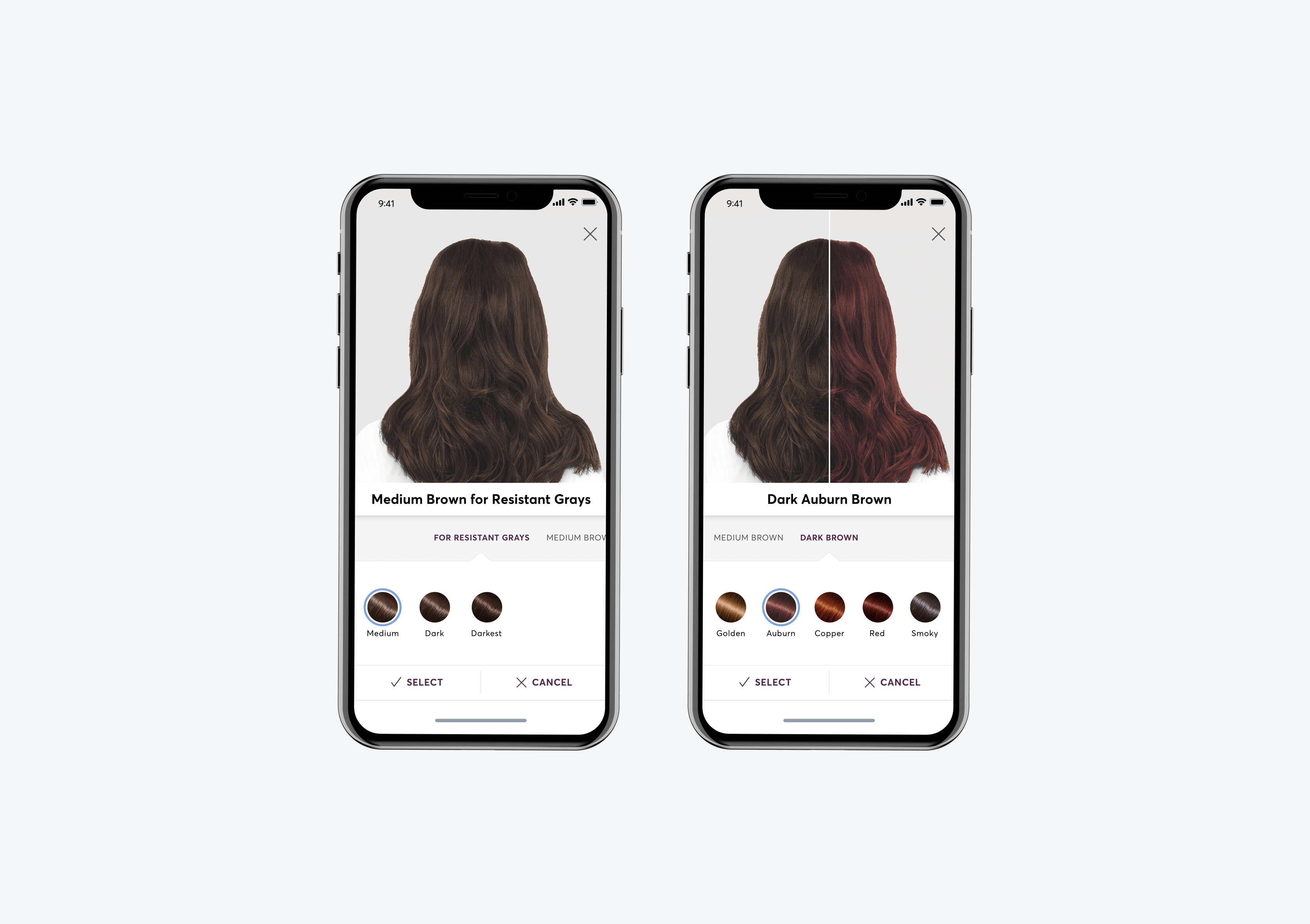
We made it easier for the user to compare the colors she was interested in. She could now look at two colors side by side to easily see the difference in the shades. We also made color descriptions more prominent to help the customer identify and remember the shades.
Homepage:
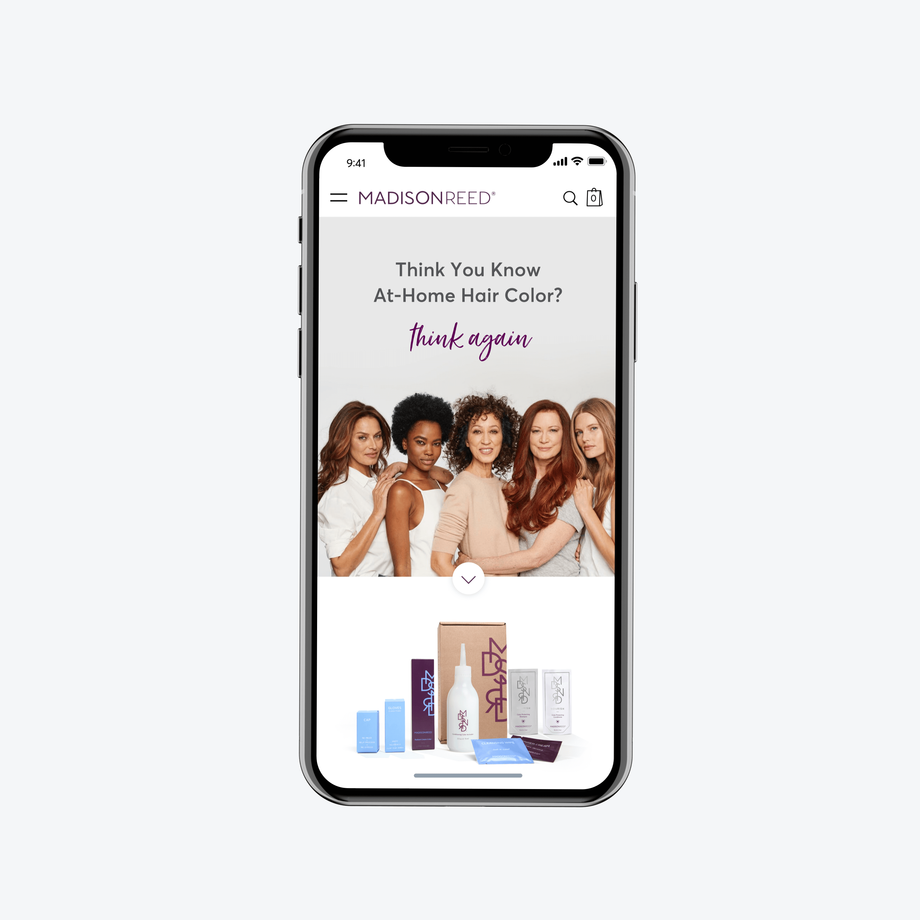
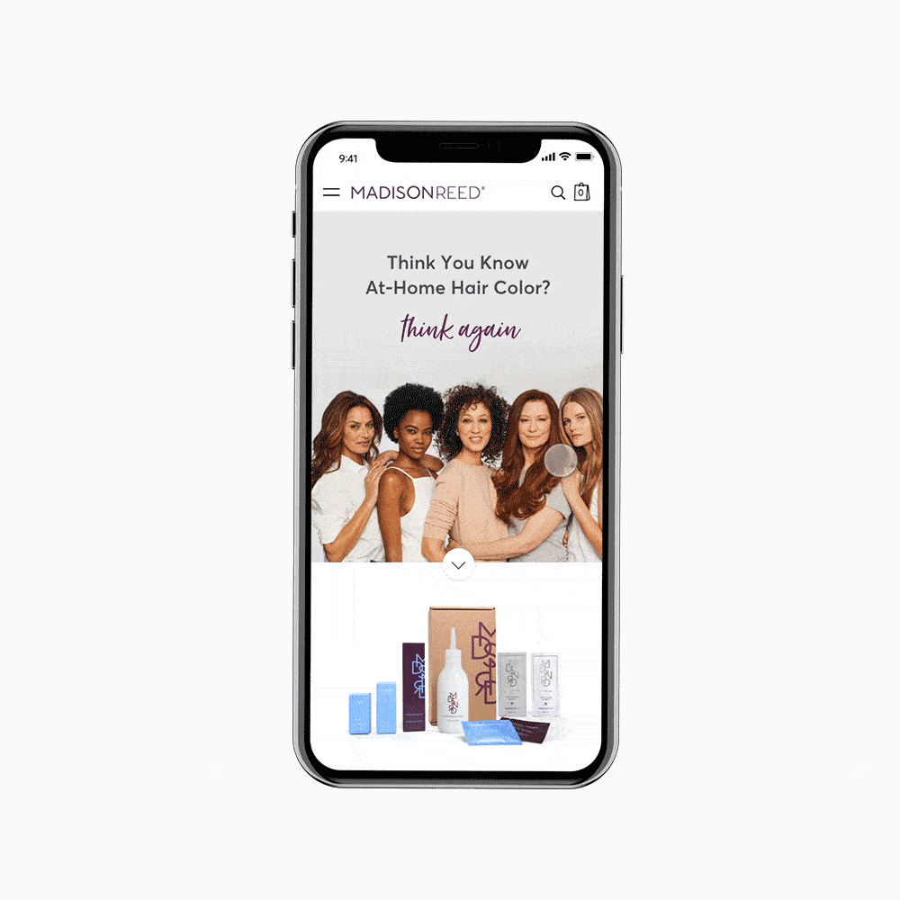
We knew it was important to encourage the customer to explore the the homepage before diving into the color quiz. That’s why we placed points of differentiation above the next step (main CTA), giving the customer an opportunity to learn why Madison Reed is different from any other hair color brand.
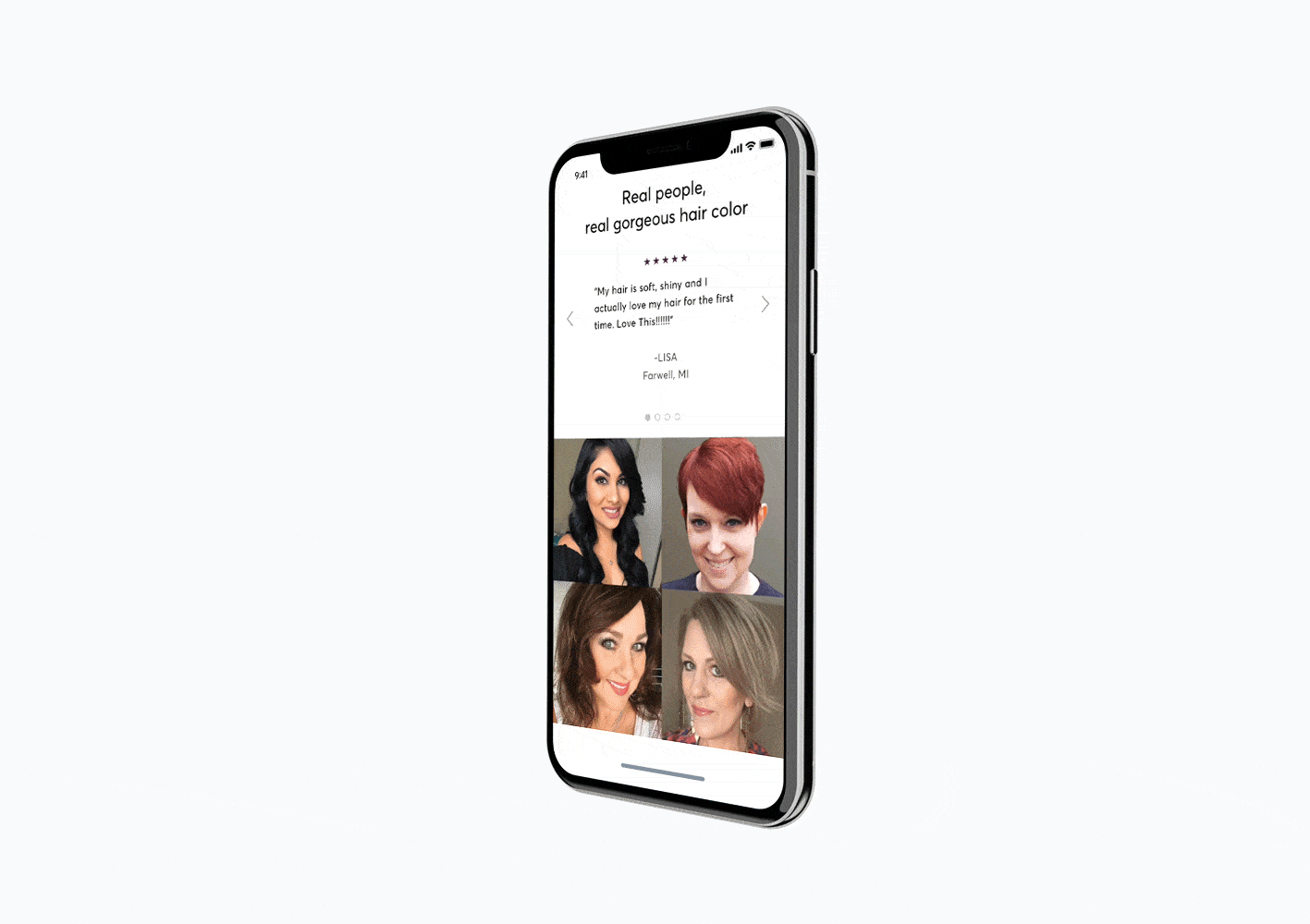
Because of the previous success with user generated content and reviews, we decided to surface this information on the HP to help the customer build trust in the brand. Customers liked seeing hair color on real, un-retouched photos of women, so we included UGC showing what hair color results she could achieve with the Madison Reed product.
Asking The
We knew it was important to encourage the customer to explore the the homepage before diving into the color quiz. That’s why we placed points of differentiation above the next step (main CTA), giving the customer an opportunity to learn why Madison Reed is different from any other hair color brand.
We have launched the redesigned experience and you can see it live at www.madison-reed.com.
All | Insurance Product Launch | AI-Powered Activity Feed | Insurance Claims Calculator | PPP Application | Path-to-Purchase Redesign | Shopping Preferences |